Company
Project period
2018 – 2020
Role
- Product Designer Pl.
Responsibilities
- UI Design
- UX
- Discoveries
- Data Analysis
- Research
- Interviews
- Testing
A new news hub with a big goal
Context
To help you understand the full project, it’s only fair to start by contextualizing the environment I was in.
iMusica is a division of Claro Brasil that develops and/or maintains various products for Claro, América Móvil, or for themselves.
The project has an ambitious goal of becoming the largest information hub in Latin America, and it was a pleasure to take part in its MVP launch and subsequent phases.
I was the Product Designer responsible for this product for 2 years, handling all aspects of the project and following its growth in 2020.
What is it?
- The stakeholders defined the product (in interviews) as a Content and VAS Hub for Claro customers.
- The target audience is Low ARPU.
- It currently has Basic and Premium plans.
- With the Basic plan, users on Claro’s base have access to regular news. With the Premium plan, anyone who wanted to could upsell for R$9.99/month.
What were the challenges?
- Since it’s a VAS product, there will always be the challenge of maintaining a good relationship between the user and the carrier;
- Gaining market share and becoming the largest news hub in Latin America;
- Scaling the product amid constant strategic shifts by the company;
- Listening to users while managing a routine of 6 products.
Our wins
The Claro Notícias product operates on a Revenue Share business model. Nothing unusual compared to other products, but it’s certainly the most sustainable model for news.
The company pays each news outlet proportionally based on user consumption. And that creates various UX challenges, such as giving equal visibility to all brands.
As a Claro-owned product, being part of the company’s VAS guaranteed payments coming from the carrier itself, which provided access to its customers. And those customers didn’t even need to access the product or know they had the right — for us to receive revenue.
This user base itself is a huge advantage. Beyond generating revenue without spending on advertising — since we were featured in Claro’s own promotional channels like microsites and bill inserts — we’d suddenly have millions of potential users at our fingertips.
Our weaknesses
The company didn’t work in an agile environment and had extremely lean teams. Unfortunately, this created a development bottleneck, slowed implementations, and degraded quality and refinement across all ends of the process.
By 2020, our Product team grew to include 4 incredibly dedicated professionals, but it was still a challenge to manage all the products (especially for the sole PM).
Data or behavior analysis tools were poorly configured or didn’t exist in the products at all.
The Product Designer was perceived as a UI Designer, and no one understood which artifacts needed to be delivered. So there was a lot of internal evangelization work to be done.
What problems does the product try to solve?
This problem was identified before I joined the company. Basically, through internal data analysis, there was a deficiency in how users read news. They would read publications received via SMS as of 2017, giving all the visibility to the partner.
150 million
news consumed monthly by Claro users via SMS.
Some issues with SMS
Very poor environment for reading news
Expensive infrastructure
Users read little of the actual content
Very low conversion
Issues with special characters and media
Links redirected to third parties
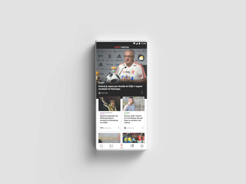
So, how do we deliver a news-reading experience that makes sense to the user?
First delivery
When I joined the company, all the interfaces were built in Photoshop, and on top of keeping up with the roadmap, I needed to improve handoff and production — since each file was extremely heavy.
So, after evaluating effort and value for the team and interviewing the developers, I proposed migrating to Adobe XD, which we already had, and continuing handoff via Zeplin, previously aligned with stakeholders.
This meant I would need to redesign the entire layout of the website and Android app. I also took the opportunity to add my own touch to the interface 🔥.


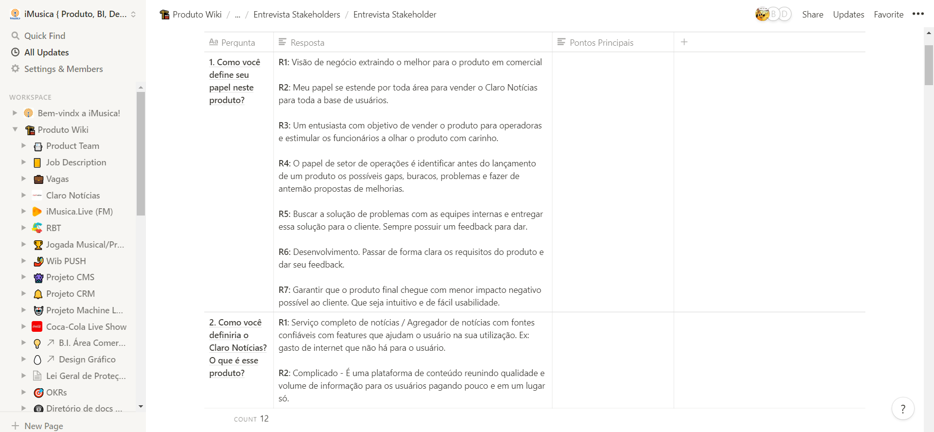
Stakeholder interviews
Objective: Align Claro Notícias’ evolution with the company’s strategies. Current and future business ideas, the company’s political and strategic vision, the product’s calling, and goals/metrics to ensure product success.
Questions asked:
How do you define your role in this product?
How would you describe Claro Notícias? What is this product?
How does this product fit into the company’s product portfolio?
Who are the biggest competitors for this product, and what are the company’s concerns regarding them?
Who is this product for?
Who does your area expect to be the product’s user in 1 to 2 years?
What is your area’s biggest concern with Claro Notícias? What would be the worst thing that could happen?
What are the business expectations for this product?
How do you think this product could be differentiated?
What would you define as success for this product?
How do you believe we could improve our customer’s experience on our platform?
Interview documentation
All interviews were conducted by myself and 1 observer Designer. They were recorded and documented in Notion, with responses categorized and affinity mapping performed.
Response excerpts
The interviews revealed a misalignment in the understanding and goal of the product across teams. The quotes below were some interesting responses from people in various roles involved in the project, such as the CEO, Marketing Director, Business Analysts, and Customer Support.
“Interactive content hub”
“A product with multiple features”
“…has features that help users during their usage”
“…distributing information in various formats”
“Has a range of personalization options”
“Low ARPU audience. The mass with the most restricted access to news.”
“We have content for all audiences.”
“…reaching a level of excellence”
“Navigation and democratic content delivery. Whether through algorithm or navigation.”
“working with multimedia aspects of news”
“quick news, gossip… Simpler content consumed on Instagram and Facebook for sharing.”
“…prioritization and categorization […] execution of CRM, big data, and machine learning.”
“I believe in the business model. If we reach a good level of technology and usability, we’ll become one of the top names in the market.”
Tableau and GA Data
Approximately 63,000 articles read and 10,000 unique users over 60 days
Of this total, 63% of the articles are from Estadão, 22% from Lance, and 15% Others. At the time, partners included: Estadão, Lance, The Music Journal, Portal Administradores, Tecmundo, and Personare.
This disproportion occurred because our architecture and news prioritization logic didn’t favor all partners equally. Essentially, whoever sent more articles appeared more.
22.000
44% of total
5,8% of total
53% from RJ and SP
Problem definition(s) in my discovery
Give visibility to other partners’ content for users;
Improve recommendations for better use of the fold-above-the-fold area, personalization, and fair distribution among partners;
Redesign navigation to accommodate product evolutions across different audiences;
Add social features with moderation;
Design a new CMS;
Improve onboarding by explaining the product’s purpose, values, and benefits.
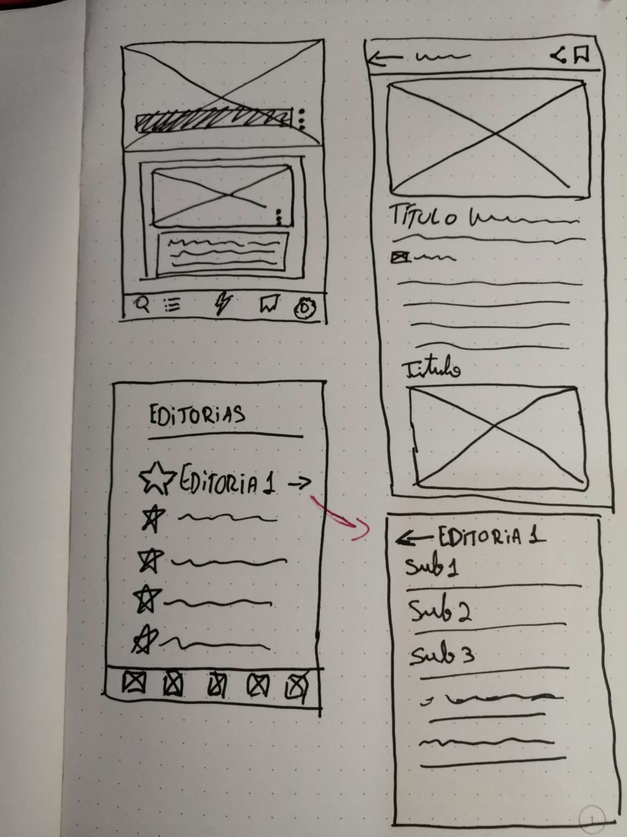
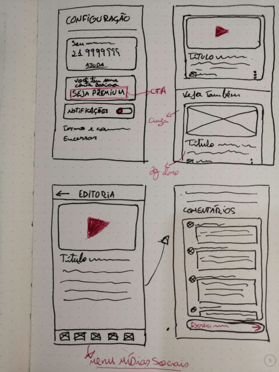
Wireframes
This is a part of the creation process I never skip — it’s fast and cheap to change direction. In the images, you can see where I start thinking about sub-editorials and comment boxes, for example.
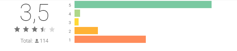
User reviews on the Play Store
User reviews were always checked by me, but unfortunately the final rating was meaningless — during the app launch, employees were encouraged to rate 5 stars. Yeah. 🙁
Knowing this, we can look at the genuine user reviews and the way the customer support kept repeating its response.


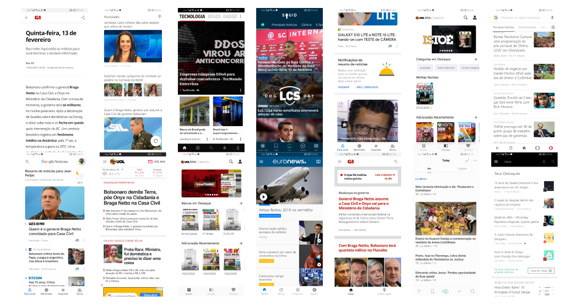
Top Android apps in the News and Magazines category
I did a brief research on Similar Web to gather more market data, and that’s where a major Desk Research began.
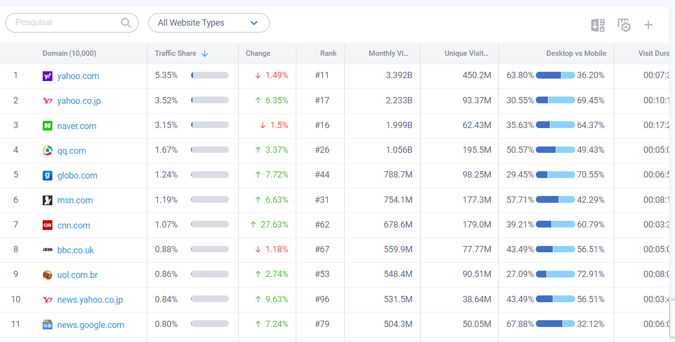
Top websites in Brazil in the News and Magazines category
This time, I sought to understand this leaderboard of news and magazine websites. Many of them we already considered our direct and indirect competitors.

A major news website benchmarking
To complete this research, it was more than necessary to look globally at this market, since product internationalization was a major company objective.
I easily visited nearly 100 news websites across the globe.
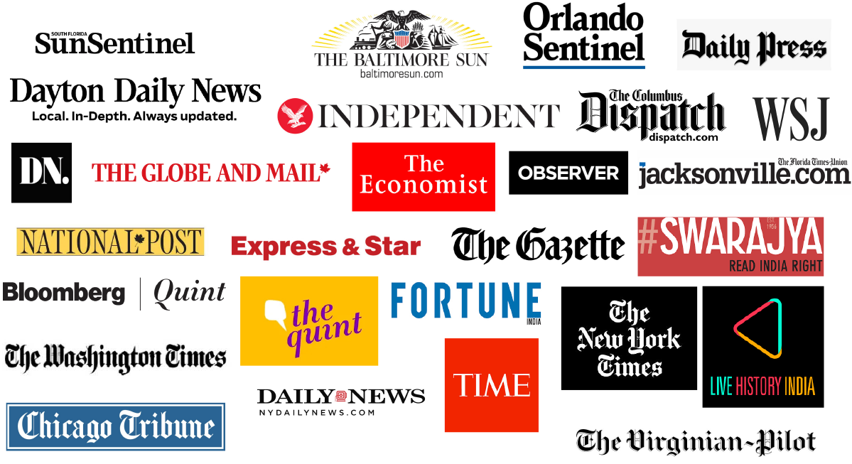
Benchmarking of news apps in Brazil
Here the goal was also to map opportunities, strengths, and weaknesses of apps in the market.
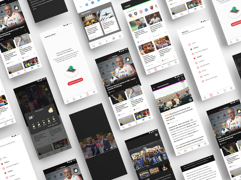
New experience
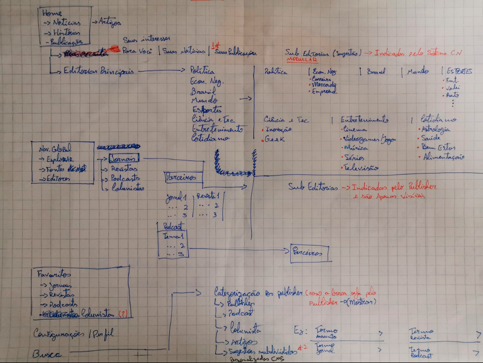
Information Architecture
Everything I had imagined for this architecture I put on paper to quickly explain it to my team. The strengths and weaknesses of all those products were boiling as opportunities to be built on. Essentially 100% of the architecture needed to be redone, but I knew exactly how to slice this solution into phases.
Wireframe of the new proposal
This was my last delivery at the company. Unfortunately, I couldn’t follow through with this reformulation. But the presentation was made to leadership and, with approval granted, the next step would be to break it down and slice it into smaller deliveries.
Access the link below to check out the document.
And what would be the next steps?
I would probably meet with my PM, Devs, Projects Team, and QA to present the proposal, identifying potential barriers in what I had designed.
Then, I’d create a Value vs. Effort matrix, validating with these other individuals how complex it would be to implement the deliveries.
Depending on the outcome, I’d be able to reduce scope or adapt it to a context that would ease feature delivery, and over time we’d adjust to reach what was originally planned.
With many new behaviors proposed in this new version, we’d need research processes embedded in our daily routine.
My learnings
In nearly 2 years at the company, I learned to mediate conversations between teams whose relationships were strained, avoiding harm to project progress.
I learned to develop interfaces based on heuristics to ensure at least a minimum of grounding, even when working outside of user-centered design.
I also learned to adapt and execute certain processes very quickly, such as remote unmoderated usability tests, which allowed me to keep working while still iterating with users.
